
Sunday, May 18, 2014
Morning Vitruvius
So I like the idea of compound drawings. This one, if examined by quadrants clockwise: Plan, Elevation, Section and Perspective. Despite the complication of this sketch, my favorite part is the whit reflection below.
Thursday, May 15, 2014
Coffee on the HIll
Despite the title, which was more about evoking memories then actually describing the location of the sketch, this was done like the rest of them so far at the comfort of my long maple farmer's table. This is another loosely applied color piece with careful lines. BUt I think it is successful as the sketch is kept small, enjoying the white space. The ring was placed a bit too soon and now resembles an aura coffee sunset.

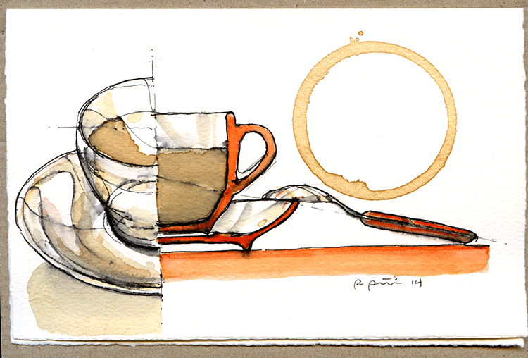
Monday, May 12, 2014
Morning Orange 2
This is a little sloppy. Maybe a reaction to my too careful earlier ones, but I like it. There is a fluidity in the wash and the lines; with the orange applied loosely without a severe amount of care to the crisp edges of the flat and cylindrical containers.

Friday, May 9, 2014
Orange Field
This came out as a nice repeat of an earlier composition. The background orange came out much more consistent and the placement of the ring provides just enough tension between the background, the white space and the spoon that there is a quiet completeness to the composition...even if it is not too experimental.

Tuesday, May 6, 2014
Quick sketch
This one was done rather fast. I am trying to do one almost every other day and in doing so I hurried this one along. I kept the image smaller and still tried to strike a balance between the descriptive section and the standard "bird's eye" view of the cup.

Saturday, May 3, 2014
Going minimal
I felt the others were getting too congested with colors, lines, shadows, etc. Kind of a congestion of representation. In this one I wanted to do simple touches of the orange handled spoon and the coffee to bring specificity of focus to the piece. I enjoy how quiet and less fussy this one became.

Wednesday, April 30, 2014
Orange Section
Now the section is orange as well as the solid horizontal and spoon. Smaller cup, smaller ring. A Careful composition but I feel it lacks the life of a more explorative drawing. Dislike thinking these are formulaic because i love the subtle compositions and testing mthods of light, shadow, surface and form...hmmm beginning to sound like architecture...
Sunday, April 27, 2014
Morning Orange
So the first few I felt didn't have a tie to Syracuse, so I have begun working orange into the palate. Now we have an orange mug reflecting a white plate on a semi reflective surface. Despite the large ring, this is Stephanie Irwin's ( the Dean's Executive Assistant) favorite so far.

Thursday, April 24, 2014
Morning joe
So not the most original name...here we see a section and perspective combination drawing. The plate on the left side gave me some grief. I was trying to get a section that was white instead of black. This forced me to make a coffee wash background... which shows the inconsistency of my brush. ugh. That's why I keep exercising!

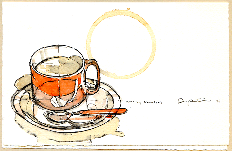
Monday, April 21, 2014
Morning exercises
I should say that the school has provided mw with Fabriano card stock which is excellent for the ink and wash I like to do. Here is the second in the series, it's my "morning exercise"

Friday, April 18, 2014
Orange Coffee...?
As a tradition on this blog, coffee sketches have often made an appearance. Recently I have assisted with syracuse Architecture to build relationships with alumni and have volunteered some of these original sketches to promote the school and generate a creative "buzz" with our alumni by providing these little sketches as a correspondence card. I'll continue to post as they develop. Here's the first one.

Tuesday, April 15, 2014
Soloman, Speaks and Stenson
So the big three at Syracuse architecture, Michael Speaks (Dean), Jonathan Solomon (associate Dean) and Tim Stenson (Undergrad Chair) are used to giving talks in front of the school. And, with pen in hand, and sometimes some coffee, I am used to sketching them.
Here is a series of Michael Speaks with Solomon near by...

And a series of Stenson addressing the incoming class.

Here is a series of Michael Speaks with Solomon near by...
And a series of Stenson addressing the incoming class.
Saturday, April 12, 2014
Syracuse architecture Faculty 2
At the Minnowbrook retreat center in the Adirondacks, run by Syracuse University, the architecture faculty escape for 2 days of messaging, presentations and camaraderie. Among the meetings and discussions is also ample time to sketch. here is Sarosh Anklesaria waiting patiently through a discussion.

below is the view of the adjacent lake from the docks of the retreat center.

below is the view of the adjacent lake from the docks of the retreat center.
Wednesday, April 9, 2014
Syracuse Architecture Faculty
Often, some of our closest relations make the best impromptu models. Here at a faculty retreat we see Joe Godlewski and Michael Speaks engaged in an academic forum.


Sunday, April 6, 2014
Open that Bottle Night Invitation
A recent client asked me to sketch an invitation for a party they were giving called "Open that Bottle Night", an event started several years ago to provide an evening to open a bottle of wine that has been waiting to be open for a special occasion. In this case it coincided with the Chinese New Year: the year of the horse. The sketch below is the product for the occasion:
 This went through a string of variations until the lines became crisp, simple and efficient.
Wednesday, April 2, 2014
Man in the Moon: Unofficial Poster: Self Reliance :4 of 4
This was the first poster of the completed set . It shows again the upside down flag from the opening sequence and the steam-punk fairies that first exhibited the large banner over the moon as the story was introduced. The Cyclists are finding their own self-reliance as technology grows in the world. In the red field behind the moon, the western hemisphere of the earth comes into view.

Sunday, March 30, 2014
Man in the Moon: Unofficial posters: Liberty : 3 of 4
"Liberty" is a combination of imagery. The focus is on the Rubber Band, and amazing bluegrass, jazzy, blues band that opened the show. At the bottom are stills from the footage projected onto the moon and the massive screens beyond: A moon catching machine, The Tower of Babel, Civil War soldiers. The inverted flag echoes the opening act where inverted soldiers walked upside down on the upper edge of the proscenium and proceeded to unfold and "raise" the flag which in reference to the audience, was being lowered, upside down. It was a powerful message from the beginning.

Thursday, March 27, 2014
Man in the Moon: unofficial poster: Light of mine: 2 of 4
One of the most amazing moments in the show is when "This little light of mine, I'm going to make it shine" was played when the stage went dark and these bulbous balloons came out and seemed to lift the dancers right off the stage and into the air traveling perilously close to the moon above. The deterioration of the paper is pretty evident in this one: in the purple region behind the dancers the texture of the worn sheet is abundantly clear.

Monday, March 24, 2014
Man in the Moon: unofficial posters: Knowledge: 1 of 4
After the trip to Salt Lake City to see "Man in the Moon" (see posting 7-12-13) I generated a poster series highlighting the live action portion of the show which was AMAZING! The posters play on the imagery of traveling carnival shows. The medium is soft pastel on an incredibly difficult pressed paper. The paper was very fibrous and was prone to deteriorate when worked too hard. (Note the discolored edges where the tape literally peeled the top layer off of the sheet when removed)


It was a real pleasure to see my work on the set again. Here Glenn is hosting Judge Napolitano and looking in between them is a redressed image of the original poster. The original above was given as a gift to Glenn for his 50th birthday.
Friday, March 21, 2014
For Stephanie
This one is a remake of an earlier composition with a stout all orange cup. Stephanie Irwin liked the original but thought the ring was too big. The ring, which has become a trademark of sorts, is the one thing that documents the true scale and is the seal of the completed composition, often being the last thing placed before the work is signed. In this case I cheated and used another bottom edge so as to test the composition of scale. I can't help but feel I cheated a bit, and not confident it is better, but for Mrs. Irwin, it was worth the exploration.
Believe Again: Album covers
After a series of sketches and development with the details, below are the front and back cover of the album. The original began as a water colour and then that was made into a physical model which was photographed under different lighting conditions. With the help of Joel West, the photoshop king, we finalized the images below.

With the front of the album acting as a stage set, the back listing of performers and songs acts as the "playbill" to the cover theatrical show. The collage of items is to mimic a shadow box...a memory box.

Tuesday, March 18, 2014
Believe Again : Sketches


Saturday, March 15, 2014
New Mugs
We got new mugs and also some beautiful cotton laid cards from Paris in about the same week. With a new batch of Kubal coffee... it became a perfect combination for a little sketch.

Friday, March 14, 2014
Airport sketches
These are way too delayed, but I was able to sketch a passenger waiting and the interior of the plane again. The series of lines, patterns & internal forms always arrest my attention and the exploration of the line is always appealing.

Subscribe to:
Comments (Atom)