
Showing posts with label Syracuse alumni correspondence. Show all posts
Showing posts with label Syracuse alumni correspondence. Show all posts
Sunday, May 18, 2014
Morning Vitruvius
So I like the idea of compound drawings. This one, if examined by quadrants clockwise: Plan, Elevation, Section and Perspective. Despite the complication of this sketch, my favorite part is the whit reflection below.


Thursday, May 15, 2014
Coffee on the HIll
Despite the title, which was more about evoking memories then actually describing the location of the sketch, this was done like the rest of them so far at the comfort of my long maple farmer's table. This is another loosely applied color piece with careful lines. BUt I think it is successful as the sketch is kept small, enjoying the white space. The ring was placed a bit too soon and now resembles an aura coffee sunset.

Monday, May 12, 2014
Morning Orange 2
This is a little sloppy. Maybe a reaction to my too careful earlier ones, but I like it. There is a fluidity in the wash and the lines; with the orange applied loosely without a severe amount of care to the crisp edges of the flat and cylindrical containers.

Friday, May 9, 2014
Orange Field
This came out as a nice repeat of an earlier composition. The background orange came out much more consistent and the placement of the ring provides just enough tension between the background, the white space and the spoon that there is a quiet completeness to the composition...even if it is not too experimental.

Tuesday, May 6, 2014
Quick sketch
This one was done rather fast. I am trying to do one almost every other day and in doing so I hurried this one along. I kept the image smaller and still tried to strike a balance between the descriptive section and the standard "bird's eye" view of the cup.

Saturday, May 3, 2014
Going minimal
I felt the others were getting too congested with colors, lines, shadows, etc. Kind of a congestion of representation. In this one I wanted to do simple touches of the orange handled spoon and the coffee to bring specificity of focus to the piece. I enjoy how quiet and less fussy this one became.

Wednesday, April 30, 2014
Orange Section
Now the section is orange as well as the solid horizontal and spoon. Smaller cup, smaller ring. A Careful composition but I feel it lacks the life of a more explorative drawing. Dislike thinking these are formulaic because i love the subtle compositions and testing mthods of light, shadow, surface and form...hmmm beginning to sound like architecture...
Sunday, April 27, 2014
Morning Orange
So the first few I felt didn't have a tie to Syracuse, so I have begun working orange into the palate. Now we have an orange mug reflecting a white plate on a semi reflective surface. Despite the large ring, this is Stephanie Irwin's ( the Dean's Executive Assistant) favorite so far.

Thursday, April 24, 2014
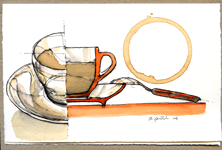
Morning joe
So not the most original name...here we see a section and perspective combination drawing. The plate on the left side gave me some grief. I was trying to get a section that was white instead of black. This forced me to make a coffee wash background... which shows the inconsistency of my brush. ugh. That's why I keep exercising!

Monday, April 21, 2014
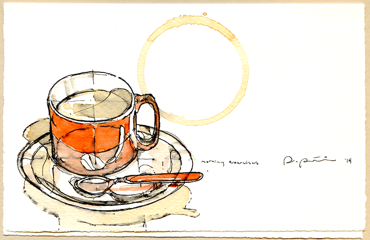
Morning exercises
I should say that the school has provided mw with Fabriano card stock which is excellent for the ink and wash I like to do. Here is the second in the series, it's my "morning exercise"

Friday, April 18, 2014
Orange Coffee...?
As a tradition on this blog, coffee sketches have often made an appearance. Recently I have assisted with syracuse Architecture to build relationships with alumni and have volunteered some of these original sketches to promote the school and generate a creative "buzz" with our alumni by providing these little sketches as a correspondence card. I'll continue to post as they develop. Here's the first one.

Friday, March 21, 2014
For Stephanie
This one is a remake of an earlier composition with a stout all orange cup. Stephanie Irwin liked the original but thought the ring was too big. The ring, which has become a trademark of sorts, is the one thing that documents the true scale and is the seal of the completed composition, often being the last thing placed before the work is signed. In this case I cheated and used another bottom edge so as to test the composition of scale. I can't help but feel I cheated a bit, and not confident it is better, but for Mrs. Irwin, it was worth the exploration.
Subscribe to:
Posts (Atom)